
Silver Sixpence
Ten years of handcrafted veils and accessories. Her brand just needed to catch up.
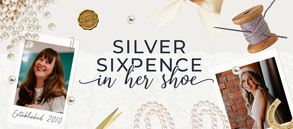
Over a decade of craft. Finally dressed to match.
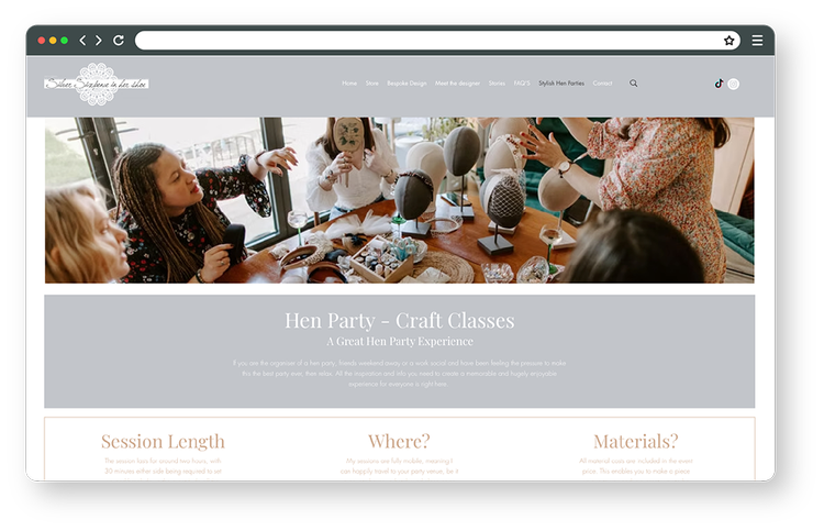
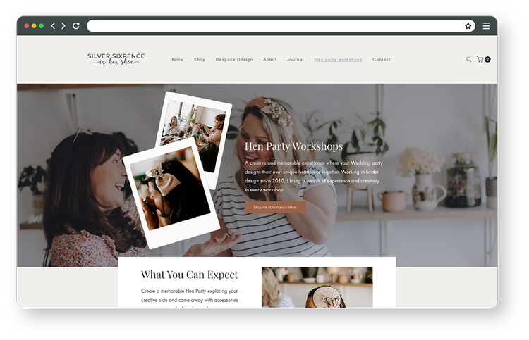
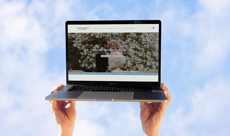
The existing brand and website had done its job, but Nicola had outgrown them. The site needed restructuring with clearer messaging, a more intuitive shopping experience, and a visual identity that felt as refined as the products themselves.
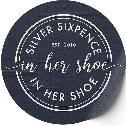
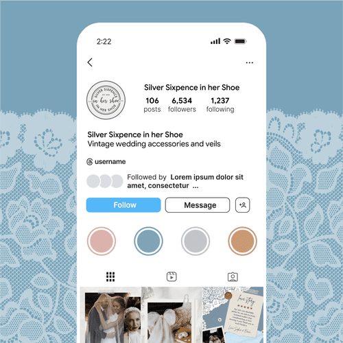
The new logo pairs modern calligraphy script with clean serif lettering, giving it warmth and polish in equal measure. A delicate monogram submark sits within a circular frame, a subtle nod to the sixpence without being too on the nose. Deep navy and soft cream form the core palette, giving the identity real contrast and versatility across every format.
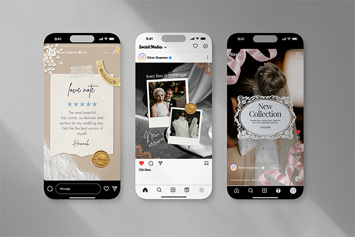
Supporting the logo, we brought in textures and details drawn from Nicola's craft: lace, pearls, vintage buttons, and cotton reels used as subtle visual accents. A set of paper-style assets add handmade, tactile quality without tipping the balance into overly vintage territory.
The Canva template suite was built for flexibility across Instagram, TikTok, and Pinterest. Editorial layouts, confident typography, and brand detail touches like the lace motif and horseshoe keep every post looking intentional and cohesive. The website was built with strong SEO foundations and full accessibility compliance so Nicola's work reaches the people searching for it.
- Logo Suite
- Monogram
- Colour palette
- Typography
- Brand Guidelines
- Website design
- Canva Templates
- Social Assets
A site as considered as the craft behind it.
"Absolutely delighted with Charlotte's work! I am already seeing improvements with my site. I particularly loved the experience I had with a rebrand. I am not the easiest to work with as I am not very tech savvy and I found Charlotte patient and understanding. She is also a lovely person and I am happy to have met her if only virtually! Would deffo recommend!"