
Known For
Jodie had built a following of over 10,000 on LinkedIn. The brand just needed to catch up.

A brand that finally matched the momentum.
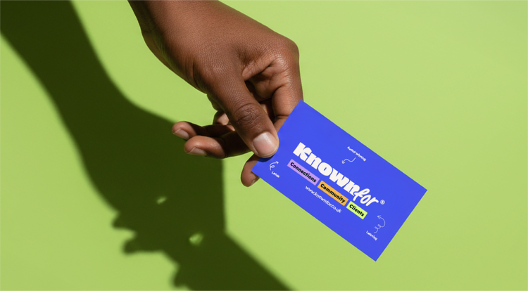
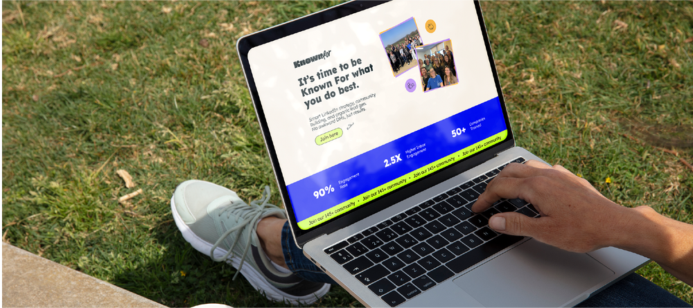
Jodie had grown her business to a point where her old identity, built around her name and her original LinkedIn community, no longer reflected where she was headed. She was launching a new name, Known For, and needed everything to feel fresh, confident, and unmistakably her: warm and full of life, but polished enough to sit alongside some of the biggest businesses in the region.
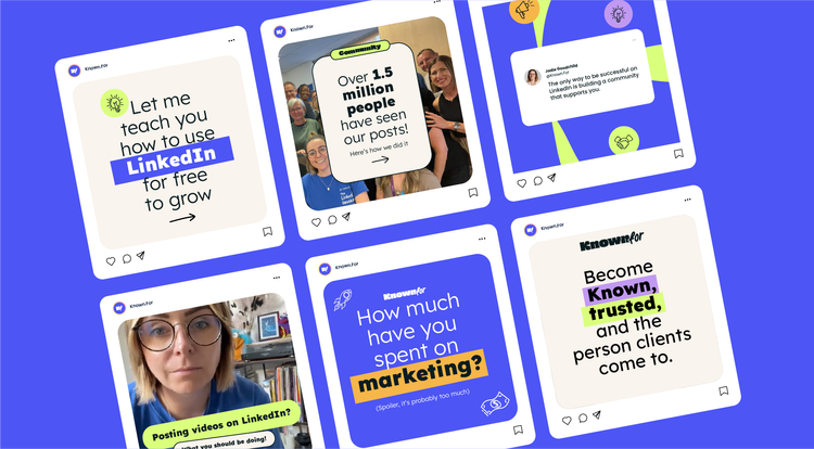
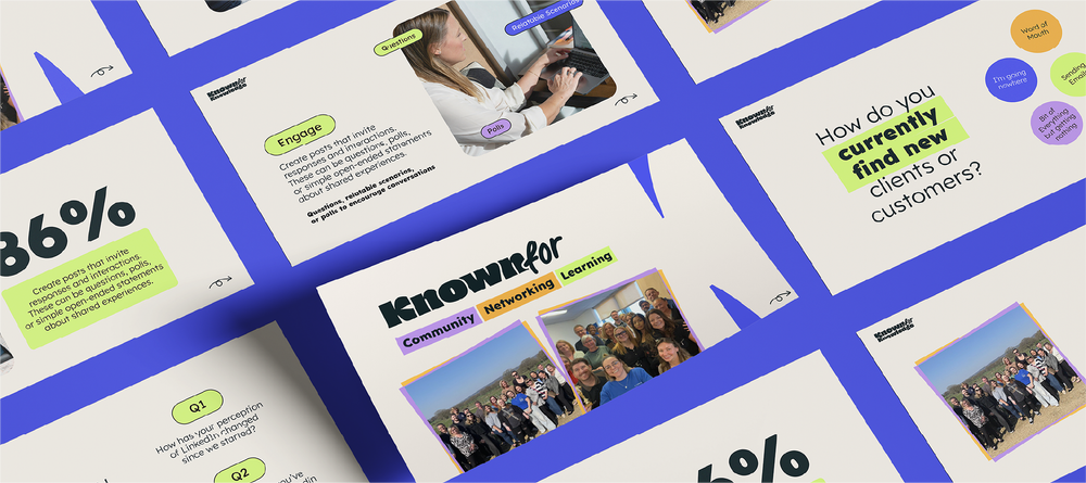
The creative direction leaned into bold, chunky typography with rounded edges that feel confident without being shouty. The palette combines warm yellow, soft cream, deep green-black, and playful lilac — vibrant enough to stop the scroll, grounded enough to feel professional. Circular shapes, arrows, and highlight graphics give the brand rhythm and movement across content formats.
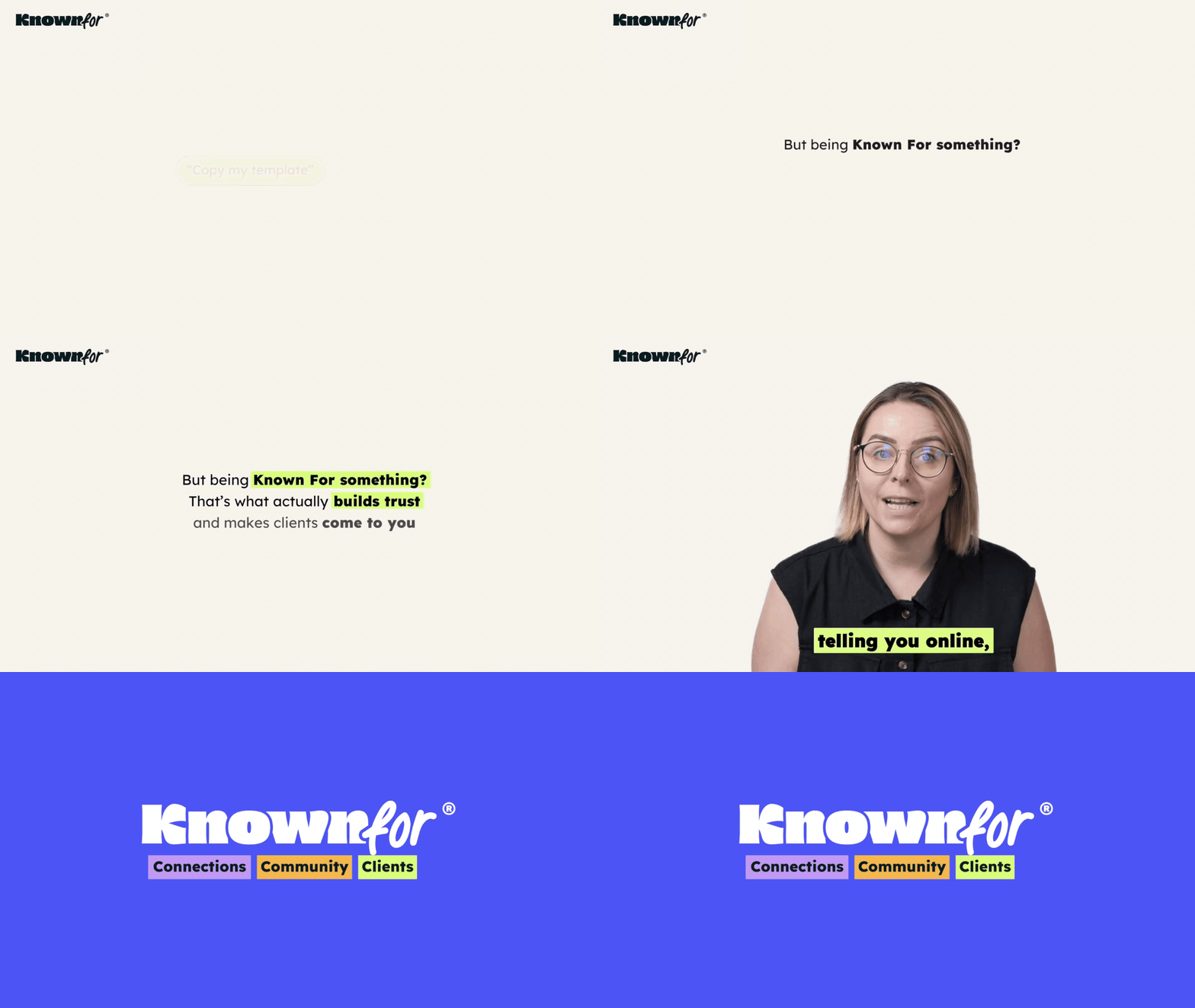
Alongside the brand identity we edited animations for her membership platform training videos, timed to launch alongside the new look. The full rollout included a brand launch party with over 100 attendees.
- Logo Suite
- Colour Palette
- Typography
- Brand Guidelines
- Graphic Elements
- Animation editing
- Social media assets
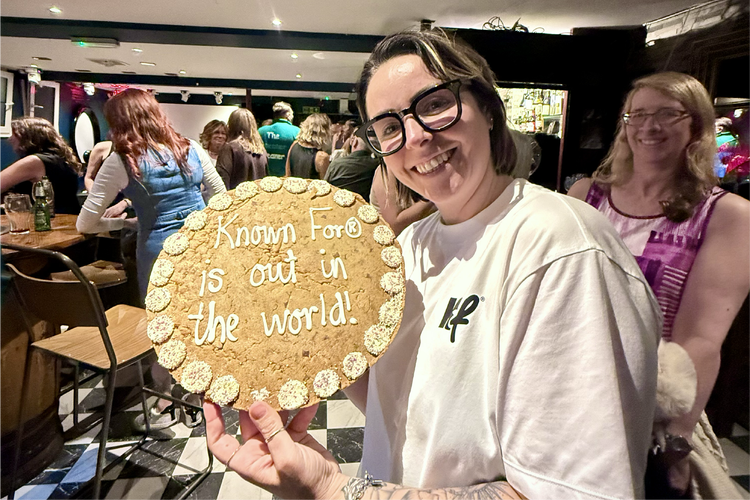 Launch party
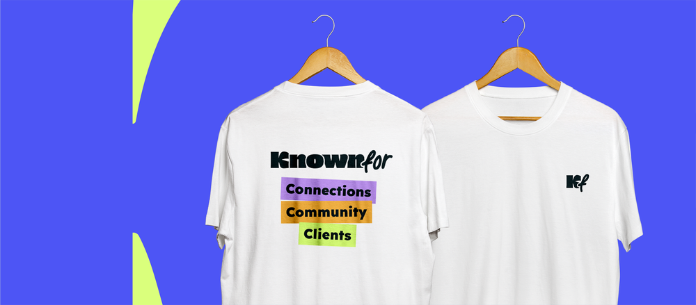
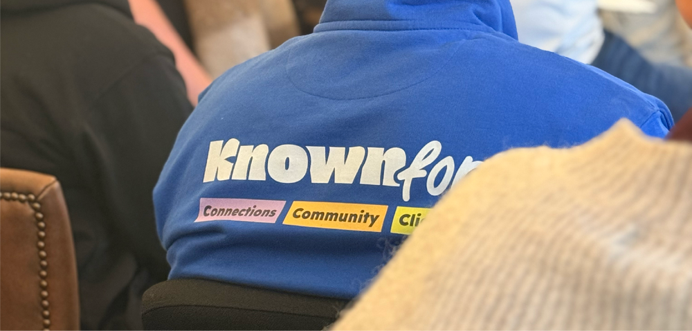 Merch
Merch
"Working with Charlotte has been nothing short of magic. It feels premium, polished, and so perfectly me."